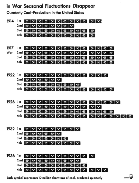
neurath fig 1
Figure 1. This chart of coal production in the US from 1914 to 1936 shows that seasonal fluctuations are a typical feature of the economy, only to disappear during what Neurath named a war economy (Neurath, P. (1973), 39, 81). In 1917 during World War I, "fluctuation was reduced to a minimum (Neurath (1939), 86)." But, except for that year, reading this chart still requires a lot of counting. Original chart from page 87 of Modern Man in the Making, 1939.

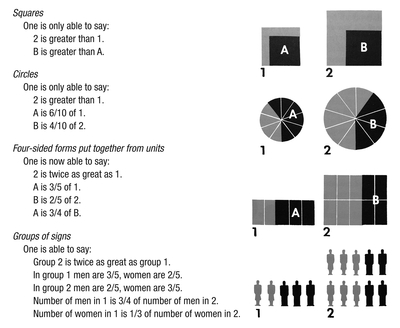
neurath fig 2
Figure 2. In these three bar charts, the two bars all depict the relative quantities of 5 and 3 units.
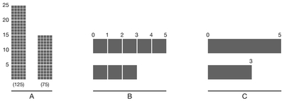
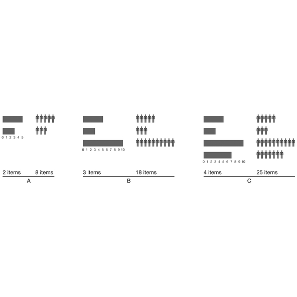
image neurath 3
Figure 3. In this comparison, the examples A, B, and C show the traditional bar chart (solid) on the left and the typical Isotype chart (pictograms) on the right. The continuous nature of the solid bars also allows for more precise data representation, while with pictograms "rounding off" is often necessary.
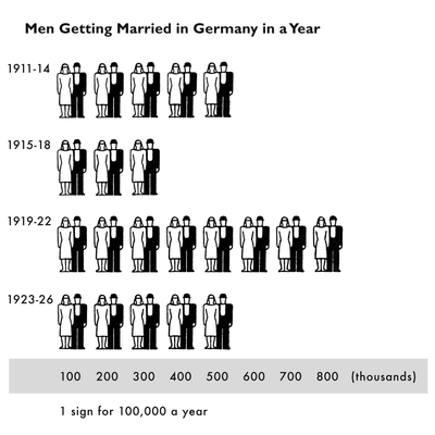
neurath figure 4
Figure 4. Author's adaptation of an Isotype chart of "Men Getting Married in Germany in a Year." The shaded area with the numerical labels on the x-axis has been added to the original, which included only the key: "1 sign for 100,000 a year." The lack of numerical labels on the quantitative axis, opting instead for a general key or scale, is a consistent feature of Isotype charts. The chart is Picture 27 in International Picture Language (Neurath (1936), 77).
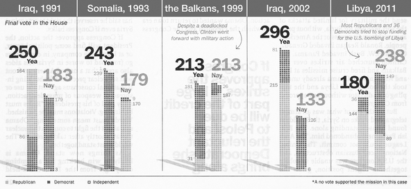
neurath fig 5
Figure 5. "How congress voted on past military strikes" (detail). The five bar charts depict US congressional votes on striking foreign countries (Scherer & Altman (2013), 16). Original colors have been changed to: light gray dot = Republican (was red); dark gray dot = Democrat (was blue); outline dot = Independent (was green). Time magazine author's collection.

neurath fig 6
Figure 6. Various map symbols used by the U.S. National Park System. Left: old, discontinued symbol for "amphitheater", as reproduced in Rudolf Modley's Handbook of Pictorial Symbols (Modley (1976), 89). Middle: current symbol for "amphitheater." Right: current symbol for "Wi-Fi" or wireless internet hot spot. Current set updated as of May 11, 2018 (National Park System, 2018).

neurath fig 7
Figure 7. A summary chart of various equal area comparisons by means of different geometric shapes and pictorial symbols. Designed by Neurath and included as Picture 35 in International Picture Language (Neurath (1936), 96-97). As in original, captions for each method and their relative merits are given on the side of the chart. The colors in the figure have been adapted: gray was red in original; black is unchanged.
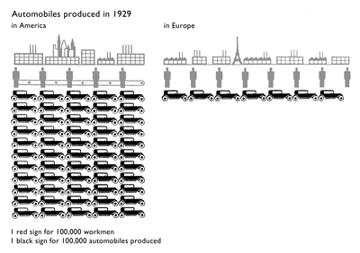
neurath fig 8
Figure 8. Isotype chart showing car production in US and Europe in 1929. Picture 33 from International Picture Language (Neurath (1936), 93). The colors have been adapted: the buildings and the workmen, shown in gray, were red in original; the black cars are unchanged.
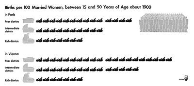
neurath fig 9
Figure 9. This chart of birth rates in Paris and Vienna around 1900, included on page 128 of Modern Man in the Making, shows much higher birth rates for the lower classes, with Neurath pointing out in the accompanying text that "birth-control [had already] started in the higher social classes (Neurath (1939), 127)."
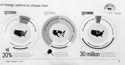
neurath fig 10
Figure 10. "Power revolution" infographic, detail. The misleading large label "30 million" refers, despite the arrow, to the tons of garbage burned, mentioned next to it, and not to the $6.6 billion biofuel subsidy visualized by the row of small squares. The confusion is compounded by mixing the consumption data with the subsidy data as if they were slices of the same pie. Original appeared in Time magazine on October 7, 2013 (Walsch (2013), 36-37). Author's collection.
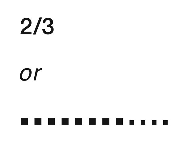
neurath fig 11
Figure 11. Which symbol better represents "two thirds?" A numerical fraction or a series of dots? (Trogu, 2015b). Author's illustration.

neurath fig 12
Figure 12. A "sale"sign in a storefront in Chinatown, San Francisco. The sign in Chinese (top) reads "the last 20 days" (direct translation), so if there's a sale, it means "20 days left." The other sign (bottom) reads "close out" which means "store closing", as in "out of business." Translation by Judy Chu. Author's photo.

Posted September 30, 2018
Visible Language 52.2
Trogu, Pino. "Counting But Losing Count: the Legacy of Otto Neurath's Isotype Charts", Visible Language, 52.2, 2018, pp. 83-109.
Abstract: Since its invention by Otto Neurath in 1920s Vienna, the Isotype system of statistical visualization hasn't gone out of fashion. Isotype charts with their rows of aligned pictograms are common today but were a novelty one hundred years ago. Some praise Isotype charts for their accessible style of repeated pictorial symbols. Others correctly believe that this figurative characteristic often gets in the way of the data-message being presented. This paper questions the soundness of requiring the viewer to engage in such a cumbersome strategy to extract information from a typical Isotype chart: counting the symbols in each row and multiplying by the given scale to get the totals. Recent psychological findings on the limitations of working memory reveal why this strategy is inefficient, and renders Isotype ineffective for displaying data greater than the number seven plus or minus two -- the famous finding of George A. Miller on the limitations of human working memory. The effectiveness of the Isotype method is therefore higher and its disadvantages less noticeable when small quantities are involved, and when other refinements can be added to the charts to aid the viewer. This paper notes that Isotype charts are subject not only to the limitation of working memory but also to the inherent ambiguity of words and images. Being culturally constituted, both words and images elude universality and are always in need of disambiguation. It suggests that Neurath was unaware of how deeply his pictograms are culturally constituted -- not universal. The paper shows how these mental and cultural limitations can be mitigated or even eliminated by the use of means that are less ambiguous because more widely dispersed globally in almost every modern culture -- namely by written arabic numerals showing absolute quantities and fractions. In many cases, written numbers are the best pictures. In today's world, they are pictures that are transcultural and psychologically immediate. By viewers throughout the world, they are so familiar that they require little mental processing time or effort. A picture is worth a thousand words. The picture of a number is worth almost any number of Isotype pictures.
"Visible Language is the oldest peer-reviewed design journal (...) first published in 1967 [on the basis that] research and scholarly information [are] essential to the development of communication design and in particular to the development of typography in its support of reading and writing."